This is a broad-concept idea that I’ve had in my head for a while and have discussed with a few people. This post is mostly a direct adaptation of those discussions. I’ve taken to calling the idea “User-Literate Technology”, mostly because, in the same way we might say that a particular person is technology-literate, we should also be able to say that a particular technology is user-literate.
In some ways, this is similar to “user-friendly”, except that it places the burden on the technology to adapt to the user, rather than the technology making it easy for the user to adapt to it. Does some particular technology in question create its own gestures and idioms, while seeking to make them easy to learn, or does the technology capture idioms that are common in the culture for which the technology is intended? If the technology errs more on the latter side, then it is “User-Literate”, more than “User-Friendly”.
Before systems can become more User-Literate, they largely need to dispense of their most prevalent interface: the keyboard and mouse. The keyboard is a text and data entry tool, but as an interface into consumer computing, it is roughly 150 keys of confusion, distraction, and indirection. For example, why do we still have a Scroll Lock function on our keyboards? Scroll Lock hasn’t been a useful feature for the last 20 years; in other words, one of the most important and significant markets for consumer computing has never lived in an era that needs a Scroll Lock. It’s like issuing every new driver a buggy whip with their driver’s license.
Mice are nice for tasks that involve precise selection of elements on a 2D plain. It was designed in an era when graphical displays were not much larger than 640×480 pixels. Nowadays, I have a laptop with a native resolution of 1600×900, and I can hook up a second monitor to it to double that space. We’re talking about screen real estate that is five to ten times larger than when the mouse first became popular. To give you an idea of what that means, take a look at the 640×480 highlighted area on my desktop screenshot (and yes, I paid for Photoshop).

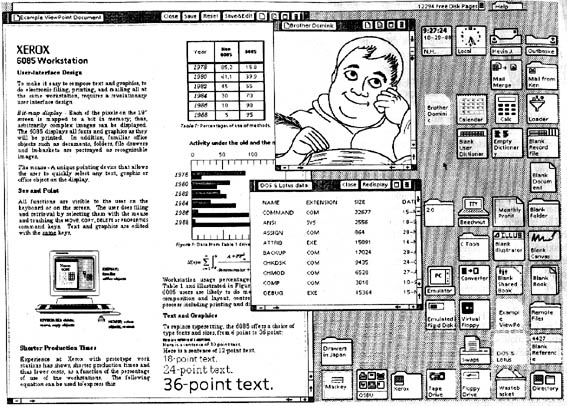
Computing has seen more huge leaps and bounds in usability than it has incremental improvements. Check out this screenshot of the Xerox Star GUI. I remind you that this is from 1981. Try to identify any functional elements from modern computer interfaces that are not in this image (protip: from a technical perspective, there aren’t any, they are all adaptations of concepts shown here).

The early GUI interfaces like Star and its clones (including Macintosh and Windows) got something very right: they made functionality discoverable. There were two primary ways in which they did this, by providing visual cues on the screen immediately in the user’s field of view, and by providing multiple access points to the functionality to accommodate users who work in different ways. Having a menu option labeled “Help” is very inviting, but advanced users learn to ignore large portions of screen text, so it’s very important to make systems that cater to both the wide-eyed (literally) newb and the hardened veteran.
Regardless, monitors are only good if the user A) has a fully functional visual sense, and B) is able to devote their attention to the display. If the user is blind or distracted by other visual tasks (say, operating a heavy machine) then the display is a large, hot paperweight on the desk.
Luckily, we are starting to see some very basic work in this area hitting the consumer market. Between systems like the iPad and the hacktastic stuff being done with the Kinect, there is a lot going on with removing computing from its keyboard-and-mouse hegemony. Still, in many cases, they often rely on the user being able to memorize gestures and command sequences. If a user has to do something unnatural–even if it is done through advance motion sensing and image processing–then it might as well just be any other button-pushing interface.
This is why I never got into the Nintendo Wii. Yes, the motion tracking of the controller was a wonderful sweet-spot between price and precision. Despite that, few–if any–of the games were doing anything actually unique with it. Instead of waggling a joystick permanently affixed to a controller base and mashing buttons, you were… waggling a joystick in mid-air and mashing buttons. The user still had to learn new motion patterns and adapt to the system.
I think Google kind of picked up on the absurdity of most modern motion-tracking systems with this year’s April Fools prank, the “Gmail Motion“. Also, I think there are some good examples of user-literate technology on the market already.
I have a Wacom tablet here that is not only pressure- but also tilt-sensitive. I’ve found that the primary training hang-up is the disconnect between moving the stylus in one location and the drawing marks showing up in another; without strong hand-eye coordination that can be difficult to adjust to. Wacom has had LCD displays for a while now that have the full touch-and-tilt sensitivity built into them. I can’t imagine how amazing working with them must be (and probably won’t for a while, the smallest one is only 12” across and costs nearly $1000. The one that I would actually want is 2 kilobucks).
There is a weather station ran by MIT with a natural language processor that you can call on your phone called JUPITER. I’ll be damned if I couldn’t figure out how to trip this thing up. Even with a fake southern accent (though reasonable, I’ve spent enough time in the south to know what they actually sound like) I couldn’t baffle it. Anything that it faltered on, I had to admit that a human would have had a hard time understanding me anyway. It’s best feature was context tracking, you could ask for the weather on a certain day in a certain city, receive it, then make an extremely contextual query like “what about the day after?” and it would get it right, “and the next day?” and BAM, weather forecastery in your ear. I heard about this thing over 5 years ago, why don’t we have flying cars yet? I understand the technology was based on a DARPA project that was being used for automated logistics in battlefield scenarios. People getting shot at don’t have time to remember how to talk to a computer. So they built a computer that could understand a screaming, cussing US Marine.
My sister cued me in to a project being developed by a group of high-schoolers in Portland, OR. A team of two 11th graders are developing voice-emotion recognition technology that; they’ve already won the Siemens Science Award in the team category. You talk into a microphone and the computer judges the emotional state you were in when you spoke. The kids are currently envisioning developing a wristwatch for autistic children who have difficulty assessing others’ emotions. The watch will flash an emoticon indicating the emotional state of the person the child is talking to.
So what is the point of all of this talk? I am organizing a symposium/exposition for User-Literate Technology. I want it to be a spring-board for starting to talk about technology that adapts to and understands how people work, rather than having artificial systems that strive to be easy to learn. Hopefully, we can have it going either by the end of the year or by this time next year. I’d like it to be a multi-disciplinary event, with equal participation from industry and academics, from artists and computer scientists and engineers. If you or your organization is interested in participating, you can reach me through the gmail with the name “smcbeth”.
We haven’t seen a major innovation in human-computer interaction in over 30 years. It’s time to start working on the problem.


I’m curious to see what input comes in from the human-machine interface community. It’s interesting how many robot/machine interaction projects are geared toward autistic kids. My friend Sophi recently wrote about a really simple bot that’s simple enough to be non-threatening to kids who otherwise get overwhelmed by human interaction. And an acquaintance, Cynthia Taylor worked on a robot that was tested with toddlers called RUBI that seemed to have some success with autistic kids.
Bonus, Cyn also co-wrote the only bit of nerdcore that I’ve ever not hated. “You never got root on any girl’s box…” Whuuuuuttt???!!
I’ve done some work with brain-computer interfaces, let me know if you’d like to meet and talk some time. I made two applications for the Emotiv, one is for children as a toy and the other is for museum goers as a tool for the curator. I’m with the Master’s of Industrial Design program at UArts.